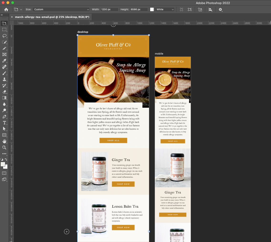
Why You Should Design Your Klaviyo Newsletters Separately for Desktop and Mobile
Oftentimes, a little more work pays off in the end. This is certainly the case for Klaviyo newsletters.
Do your Klayvio designed newsletters look great on desktop but small on mobile? Maybe they are sharp on mobile but the text is way too big when viewed on desktop. The solution is to create 2 separate designs with the same content.
Here’s a step by step guide for how to simplify the process of creating Klaviyo designs for both desktop and mobile.
Begin in photoshop with 2 artboards, one sized at 1200 px wide for desktop and one 600px for mobile. Label accordingly.
Design the newsletter as you would like it on your desktop artboard first. Make sure you have an eye-catching hero image and headline with a legible call to action above the fold. Consistent typography and a clear hierarchy is key.
Once the layout is established, you can easily copy everything over to your mobile artboard, manually adjusting your text point size, button widths, etc. for optimization. While you can have several image blocks across on desktop, it is best to have them stacked on mobile to avoid them being too small for the mobile viewer.
When your design is complete, slice and export the files from both artboards.
Pro Tip: Default email width in klaviyo is 600 px, which is optimized for mobile since that is the most common method of viewing. When uploading your sliced images, it is key to set the display options for each block on desktop to display on Desktop Only, and vice versa for mobile (Mobile Only). You’ll have to set up links separately for each layout as well.
While it may seem like a lot more work, the results are well worth it. You don’t have control over which device your customers view your emails on, so it’s best to ensure that both options are exactly how you want them. The only way to truly do that is to manually make it happen.
You just can’t trust the bots to do it for you.


